Now that The Woodlander is out, I thought it would be fun to look back at the different cover designs I went through, and let you vote on which one you like the best (there’s a poll at the end).
When I first decided to self-publish, I had my mind set on doing everything by myself: the writing, editing, formatting, and even the cover design. I liked the idea of complete control, even if I had no experience in some of these areas; it seemed very punk rock. To that end, I started designing my own cover. I didn’t have access to Photoshop, so I used the free program Gimp (Gnu Image Manipulation Program).
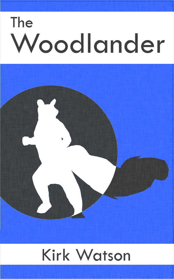
Here’s one of my first attempts:
Simple and Clean
I modeled it after those classic Penguin paperback covers like this one:

Classic Penguin
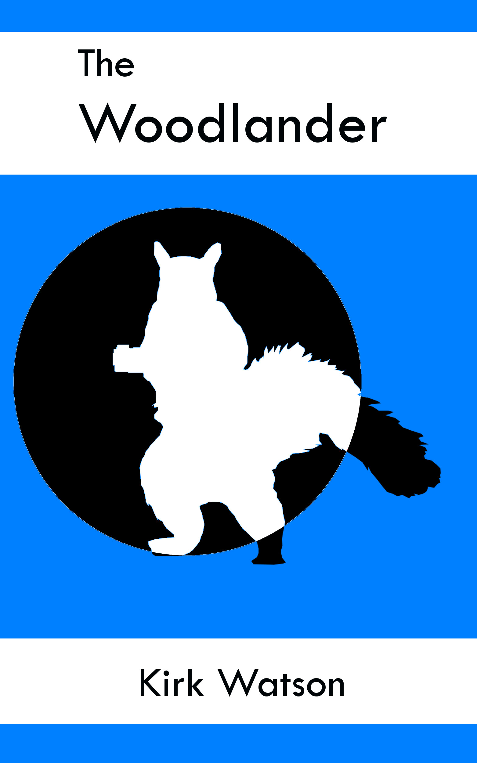
I really like the theme in the Penguin covers. My thought was to do something similar, with a different color for each sequel and a different shape (circle, square, triangle) to highlight the character. I decided the squirrel on my original cover was too busy, so I decided to try a more cartoonish silhouette. I also applied an overlay to make it appears as if it were printed on linen.
More cartoonish
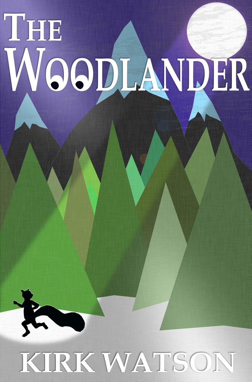
I liked this one, but the first few people I showed it to said it reminded them of James Bond. That’s not really the vibe I was going for (John Grey is more of your everyday squirrel, not some badass action hero), so I decided the circle had to go. Instead, I put in a background:
Too dark
Hmm… that was kind of drab. Maybe a little more color?

And how about a spotlight effect?
And maybe some stars?
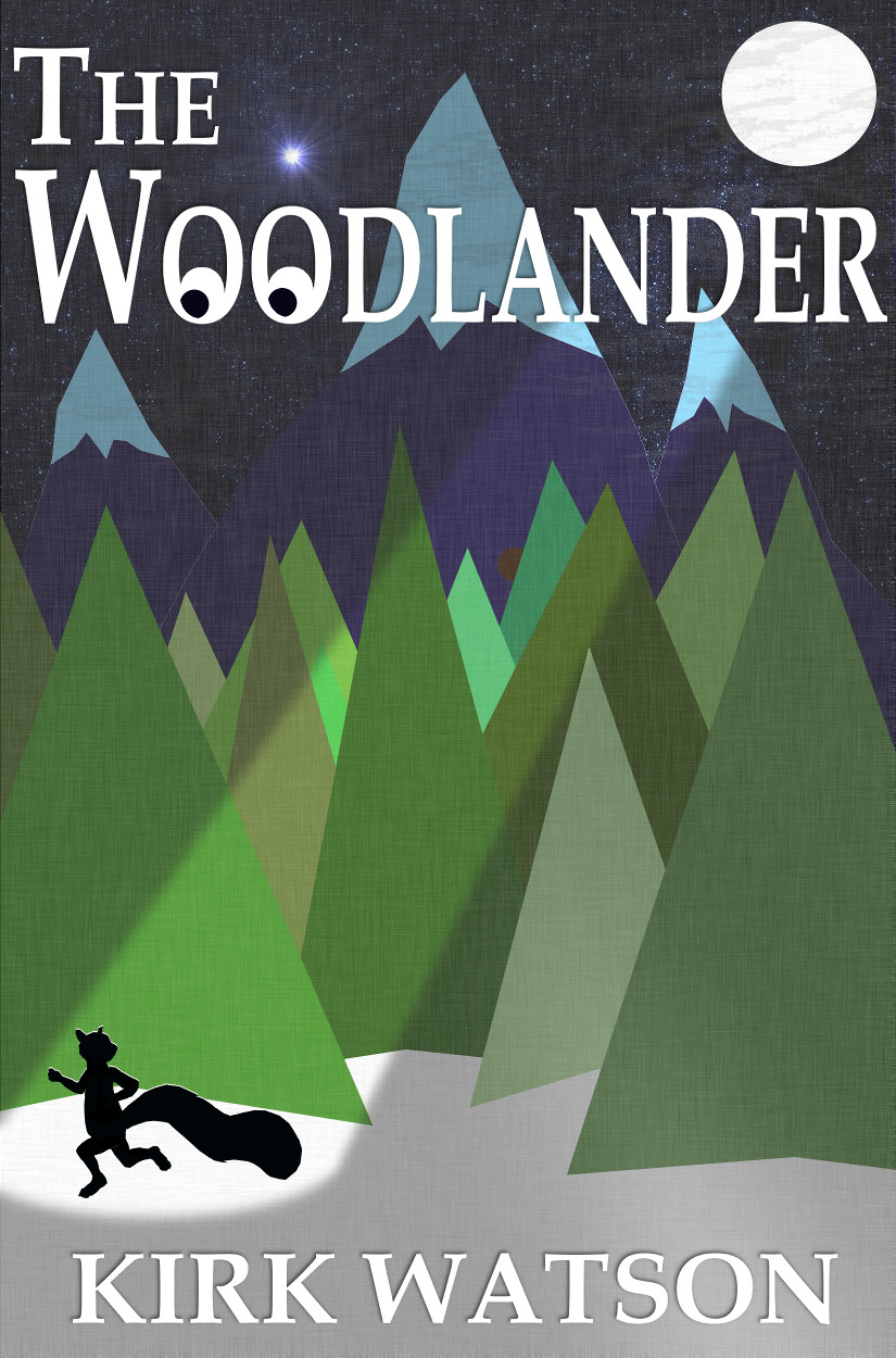
Nah, that’s too much. Here’s the final version of my self-made cover:
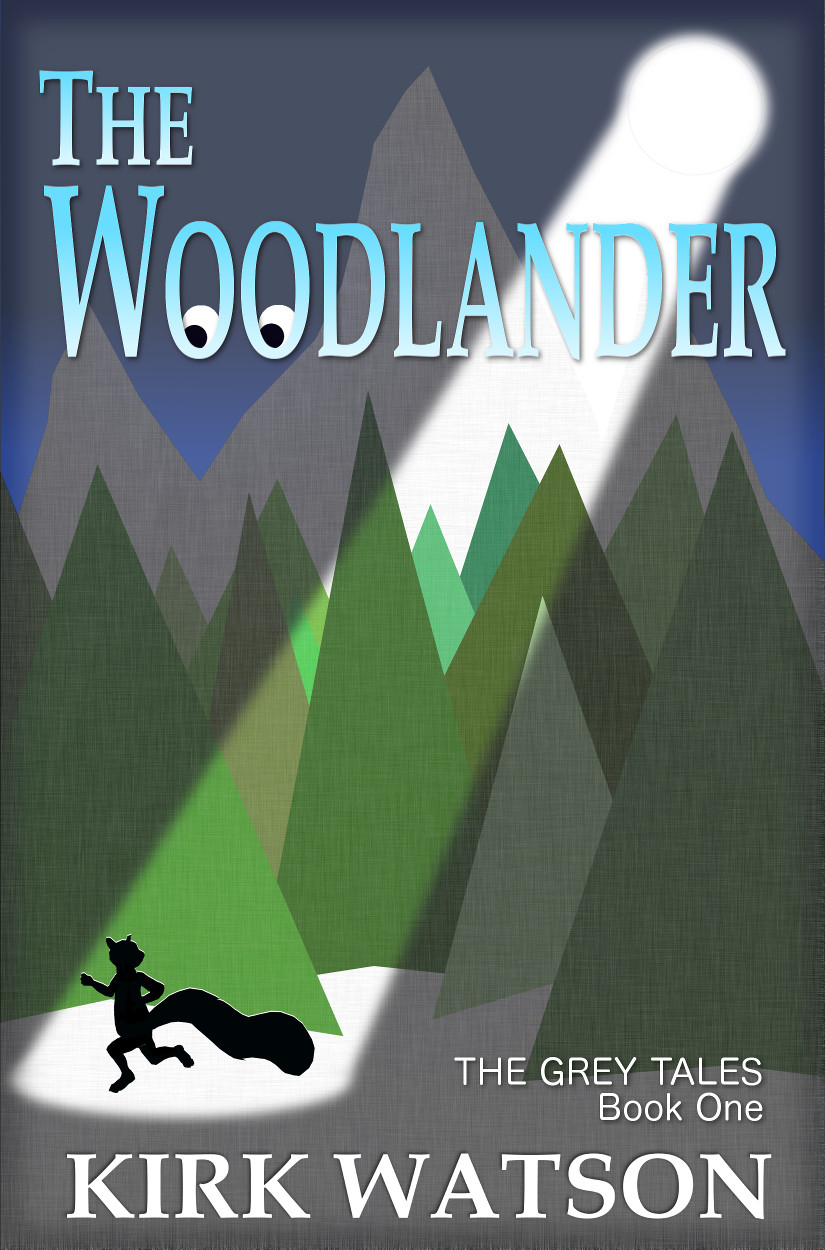
I like this one, but it still looks a bit homemade. As I got closer to publication, I decided I needed a professional cover. I bit the bullet and reached out to Damon Za (www.damonza.com) to see if he could help me out. Damon is an artist in South Africa who specializes in book covers. After giving him a list of my requirements, he came up with four different designs. I asked him to make some alterations, and we eventually arrived at these:
 |
 |
 |
 |
| Cover A | Cover B | Cover C | Cover D |
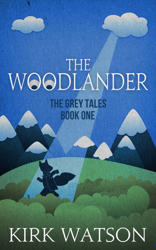
I really like all of these (I wouldn’t mind having them as framed posters in my home). I hadn’t asked Damon to riff on my original “spotlight” cover, but I guess he liked it enough to create three variants of it (A, B, and C). I think they’re all fantastic. The fourth cover (Cover D) was based on my description of The Woodlander’s main character, John Grey. I think it’s really cute. I also like how Damon applied a texture effect to each cover. It’s clear he listened to my input and put a lot of thought into each design. Now for the difficult part: choosing one of the four.
|
|
| Cover A | Cover B |
Covers A and B are very similar, but with different color schemes. My first instinct was to go with Cover B (the blue and green one). Ultimately, however, I decided it was too muddled as a thumbnail, which is how most viewers would initially see it on Amazon. The gold one (Cover A) just seemed to pop more, even if it’s not as realistic, so I put A on the top of my list.
Cover C
Cover C is like a piece of modern art. The sharp angles and use of color is really striking. But in the end, I decided it was too Wile E. Coyote. Again, I’d love to have it as a poster, but probably not as a book cover.
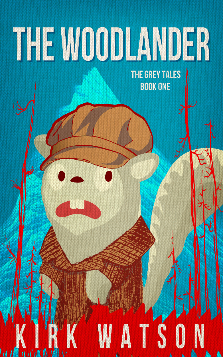
Cover D
Cover D is great, but I worried it was too cartoonish. The Woodlander isn’t exactly a children’s book, and I didn’t want anyone browsing the Kindle store to get the wrong impression. I can just imagine the angry letters from parents who bought the book for little Timmy or Susie without reading the product description first (or even the first paragraph). Uh… no, thank you. Still, out of all the covers, I thought it was the one that stood out the most, and discoverability is critical.
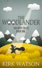
It came down to a tough choice between covers A and D. I was leaning towards D, but my friends all preferred A. I thought D would stand out more in the Kindle store, but I suppose A is more conventional. In the end, I caved to peer pressure and decided to go with Cover A. But I also purchased Cover D just in case I changed my mind (I can always swap the covers out later).
The winner:
Cover A
So, what do you think? Did I make the right choice? Vote below, and leave me a comment!
|
|
|
|
| Cover A | Cover B | Cover C | Cover D |